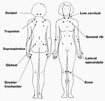
The chart below is for the purposes of clarification and verification, proving once and for all that I am both a a pain in the neck and a pain in the ass. (ass is cretina in Italian)

And I changed the template again too. I'm just not satisfied with the choices. Any suggestions?

3 comments:
I like your white background - it is quite easy to read your text against it. Your photos pop out nicely that way too. One thought would be to find a nice header for the top of your blog and fit it into your template somehow. In most blogger templates, you'll see notes about places you can put graphics and other links. The notes appear behind slashes and astericks like this: /* Note here */. My guess is that it might say something like "Header" and then "picture can go here.." Before you start experimenting, do paste a copy of your template into a Word doc and save it. Then even if you mess up (and everyone does at least once!) it is easy to get back to where you started before. Good luck!
Thanks Julie, I've been trying to shrink my profile font and pretty up the header( at least I got some purple in there!
I like the purple and the green, great colors together!
Post a Comment